Do you have an app on your smartphone or your computer that you love using? Do you find you’re grateful for the value it adds to your life, how easy it is to use, and how pleasing it looks? Now compare that to the kinds of apps you might have used as part of your life science research.
Life science software, like bioinformatics tools, is often complicated and frustrating to use. The complex data, diverse groups of users, and the need for deep domain knowledge are some of the reasons for this that we’ve previously outlined. Guidelines and recommendations on how to make tools more user-friendly are available, yet there is a general lack of funding for R&D software. This has led to many scientists struggling with underfunded, underpowered, outdated software tools.
Like much of the software that scientists use, BenchSci must overcome similar challenges. We need to organize massive and complex datasets collected by AI technology, in a way that helps scientists find research-accelerating insights. Our users have a variety of different needs. Determining the best method for organizing all the data can leave us perplexed at times.
That’s why we’re particularly proud that Google Design profiled BenchSci as a top example of AI user experience. It isn’t easy. So how do we know we’re creating the right features that are valuable for scientists? In what way should users interact and see all the collected data? We achieve this by keeping our end-users at the forefront of our minds throughout our process and utilizing user-centered design.
User-centered design is worth the time
User-centered design is a process used by software creators to ensure they are building the right thing for their users. Its goal is to design software that meets the needs of their end-users and leaves them with a positive experience. At BenchSci, we start with research to understand a user’s needs. We then decide what use cases or user problems to focus on. Following that, we design and prototype solutions, which are then validated with our users.
A process like this can be intensive for companies. It involves a myriad of team members, coordination, time, and resources. So why do we take this process seriously? It’s because we have a deep appreciation for our end-users’ goals of finding insights to expedite their research. Building useful and intuitive features streamline research, which in turn accelerates innovation. Any barrier to getting the right insights hinders productivity and slows the pace of discoveries.
Four steps to building usable life science software
Recently, Google Design (a team within Google that works to advance design and technology) showcased how we use a human-centered approach to design our AI-powered software for trust. Here’s the video:
So what are the steps we take to achieve these results? We keep a finger on the pulse of our users’ needs using several methods:
-
User research. We love speaking to scientists. We try to understand in as much detail as possible what challenges they face when finding the right reagents. Our customer success and support team continuously speak with scientists. They keep their ears open to the parts of the platform that scientists struggle with.
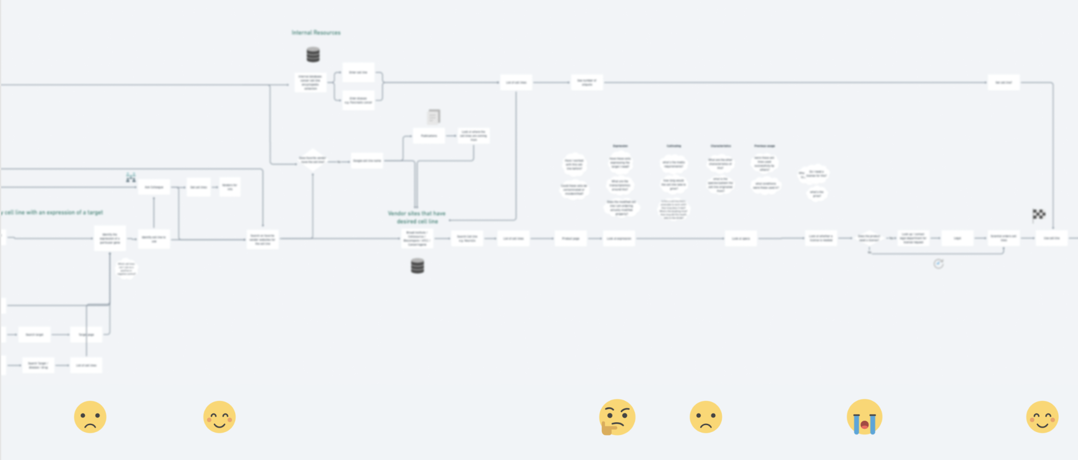
When we plan to add new types of data to our platform, like new reagents, our product team interviews scientists who use those reagents about the struggles they have encountered. We map out the complex ways the scientists go about completing their work and take note of particularly frustrating areas (see image below). These pain points are areas we try to tackle with our software.

-
Validating designs with users. When we have ideas about ways we can solve the pain points scientists face, we create prototypes for our users to play with. We put the prototypes in front of scientists and ask them to complete tasks that they might face. We use the learnings to iterate on the design, scratch out areas that didn’t work, and add new ideas.
-
Subject matter experts. The deep subject matter required when working on life science software is another hurdle to jump. We have team members who have lived past lives as bench scientists, and take advantage of their knowledge by involving them throughout our design and development process. We turn to them when we have questions, run our designs and prototypes past them, and check the language we use to ensure comprehension.
-
Analytics. We look at anonymized user data, in accordance with our privacy policy and using SOC 2 Type 2-compliant processes, to understand how scientists are interacting with specific elements on the platform. This helps us understand how features are used (or not used) and leads us to make better decisions about how to improve the platform.
Analytics, subject matter experts, validation of designs, and continual conversations with our users are key to creating useful life sciences software. People often can’t believe how much hard work goes into making every little feature valuable and easy to use. It’s a process we love and get plenty of gratification from. Especially when we see and hear that our users are expediting their research because of it.